
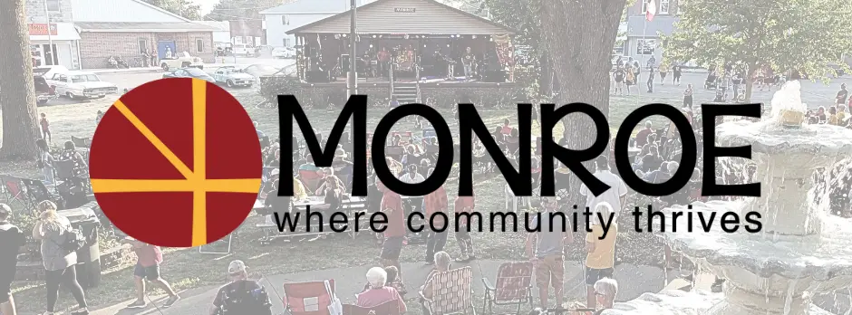
A new city logo and slogan have been adopted unanimously by the Monroe City Council. The new logo comes with the slogan, “Where Community Thrives.” The logo is an updated take on the two highways that intersect at Monroe, along with the new bike trail. The thicker lines in the logo represent the crossing of Highways 14 and 163, while the thinner diagonal line represents the new bike trail that heads northwest through town. The logo also incorporates the PCM school colors, signifying how intertwined the city and school district are, and the strong relationship that has been formed between them. The new logo will be used on letterhead, the website and the entrance sign located at the northwest side of town outside the city limits. Monroe’s previous logo included a curved “X” to the left of the town’s name, which was above the words “AT THE CROSSROADS.”